The Attraction of Opposites
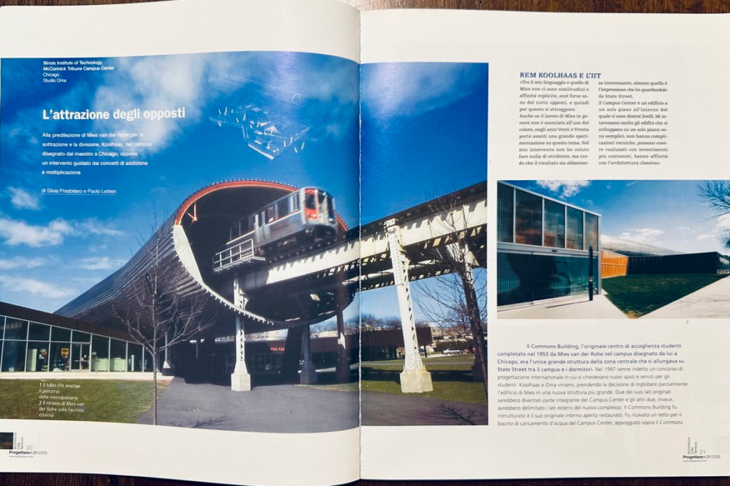
An article of mine originally published in: Progettare – Architettura, Città, Territorio. June 2005. Ed. Tecniche Nuove. Written with Silvia Presbitero, with my photographs.
In contrast to Mies van der Rohe’s preference for subtraction and division, Koolhaas, in the campus designed by the master in Chicago, proposes an intervention guided by the principles of addition and multiplication.
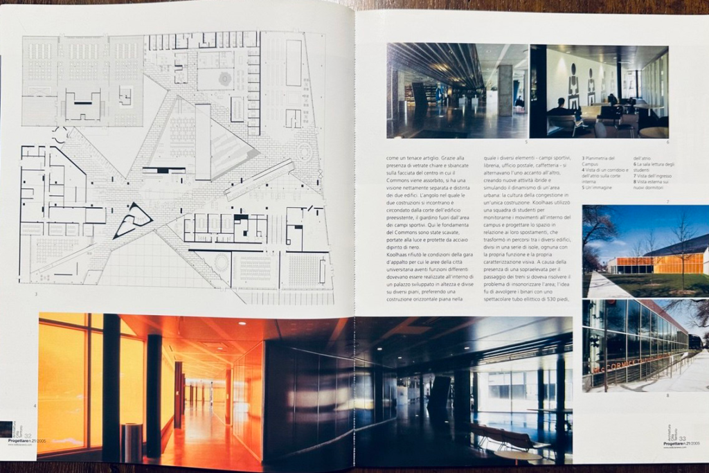
The Commons Building, the original student centre completed in 1953 by Mies van der Rohe on the Chicago campus he designed, was the only major structure in the central area stretching along State Street between the campus and the student residences. In 1997, an international design competition was launched to provide new spaces and services for students. Koolhaas and OMA won the competition, deciding to partially incorporate Mies’s building into a larger new structure. Two of its original sides would become an integral part of the Campus Center, while the other two would define the outer boundaries of the new complex.
The Commons Building was refurbished, and its original open interior was restored. A roof was created for the Campus Center’s water-loading basin, resting above the Commons like a tenacious claw. The use of clear, bleached glazing on the façade of the centre into which the Commons is absorbed ensures that the two buildings remain clearly distinct and separate. The junction between the two structures is surrounded by the courtyard of the original building, the garden beyond the sports fields. Here, the foundations of the Commons have been excavated and exposed, then protected by black-painted steel. Koolhaas rejected the competition brief’s requirement that the different functions of the campus be accommodated within a vertically developed building, with each function assigned to a separate floor. Instead, he opted for a low-rise, horizontal structure in which different elements—sports facilities, a library, a post office and a café—are arranged alongside one another. This configuration generates new hybrid activities and simulates the dynamism of an urban area: the culture of congestion within a single building. Koolhaas employed a team of students to monitor movement across the campus and design the spaces in response to their patterns of circulation. These movements were translated into routes connecting the different buildings, organised as a series of islands, each with its own function and visual identity.
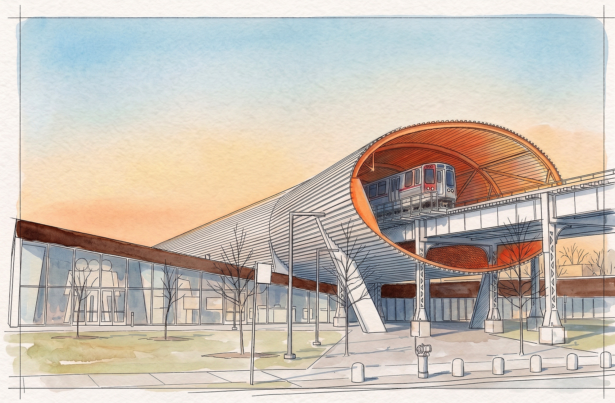
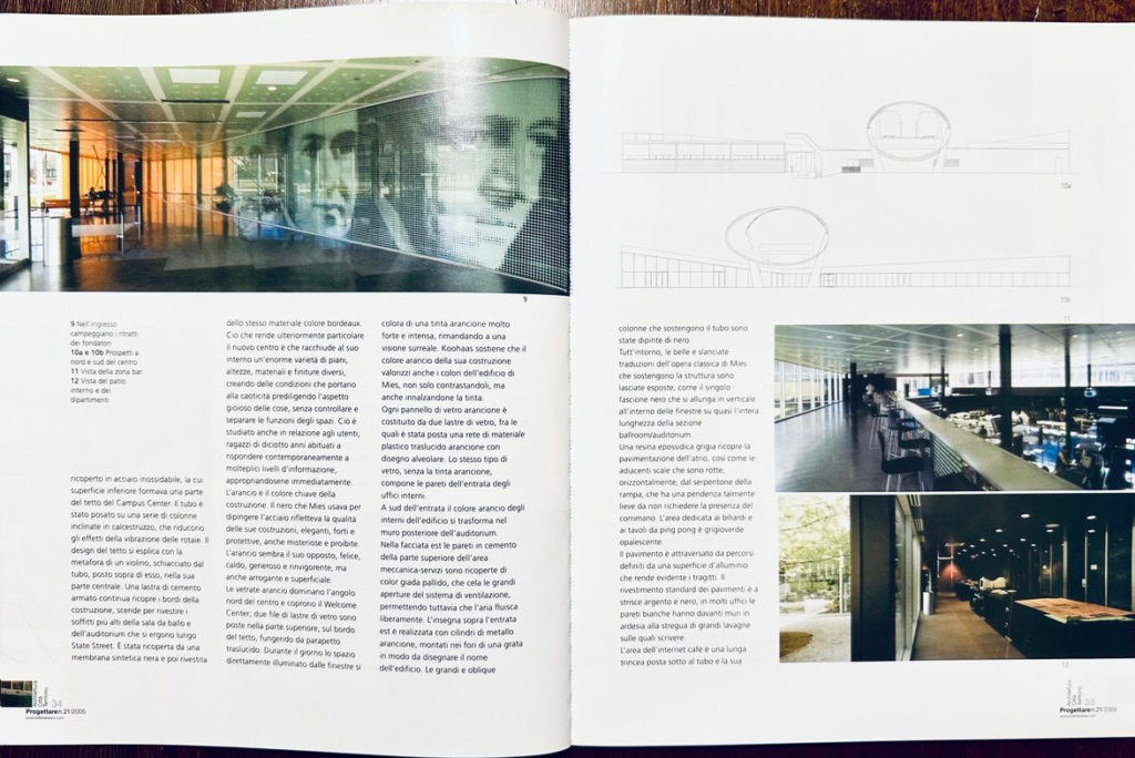
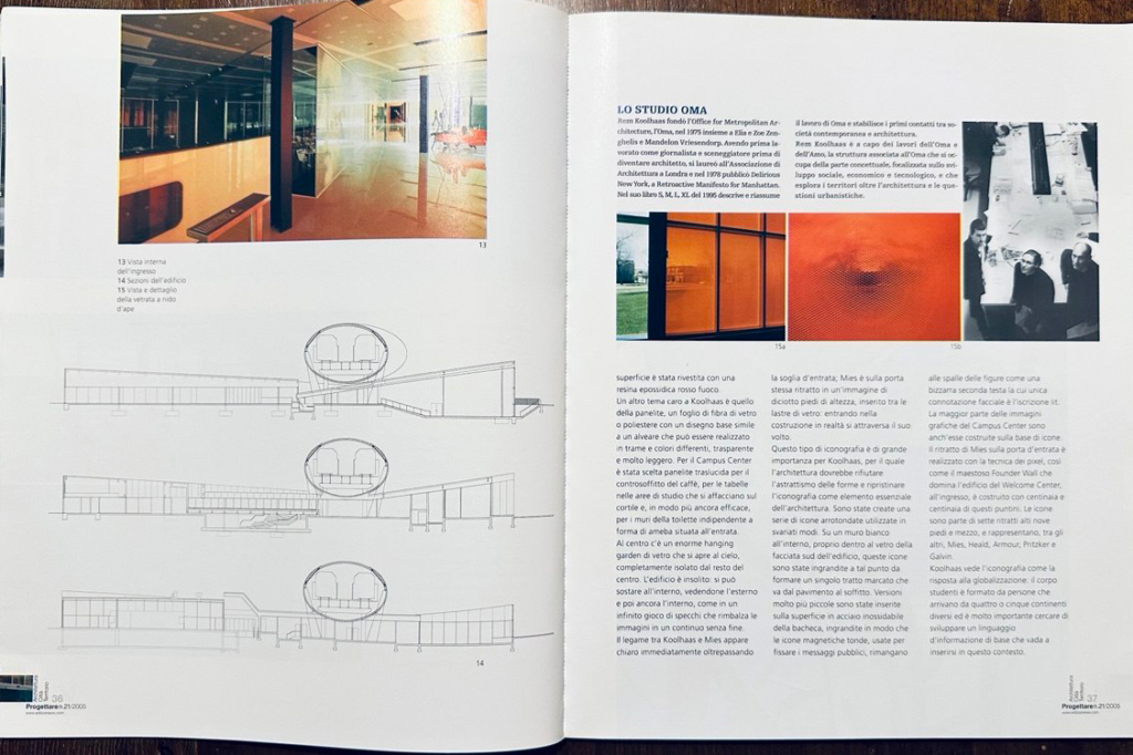
The presence of an elevated railway line presented the challenge of sound insulation. The solution was to enclose the tracks within a spectacular 530-foot-long elliptical tube clad in stainless steel, whose underside forms part of the Campus Center roof. The tube rests on a series of inclined concrete columns designed to reduce the effects of rail vibration. The roof design develops a metaphor based on a violin, crushed at its centre by the tube resting above it. A continuous reinforced-concrete slab covers the edges of the building and descends to form the ceilings of the ballroom and auditorium, which rise along State Street. The slab was covered with a black synthetic membrane and then finished with the same material in burgundy. What makes the new centre particularly distinctive is the enormous variety of floor levels, heights, materials and finishes contained within it. These generate conditions that embrace a degree of chaos, privileging the playful and joyful aspects of space rather than controlling and separating its different functions. This approach was also developed in response to the users themselves: eighteen-year-old students accustomed to processing multiple layers of information simultaneously and appropriating them almost instantaneously.
Orange is the key colour of the building. The black Mies used to paint steel reflected the qualities of his architecture: elegant, strong and protective, yet also mysterious and forbidden. Orange appears to be its opposite: cheerful, warm, generous and invigorating, but also arrogant and superficial. Orange glazing dominates the northern corner of the centre and encloses the Welcome Center. Two rows of glass panels run along the upper edge of the roof, forming a translucent balustrade. During the day, the space directly illuminated by the windows takes on an intense, vivid orange hue, creating an almost surreal visual effect. Koolhaas argues that the orange of his building also enhances the colours of Mies’s architecture, not merely by contrasting with them but by intensifying their tonal qualities. Each orange glass panel consists of two sheets of glass with a translucent orange plastic mesh, featuring a honeycomb pattern, sandwiched between them. The same type of glass, without the orange tint, forms the walls at the entrance to the internal offices.South of the entrance, the orange of the building’s interior becomes the rear wall of the auditorium.
On the eastern façade, the concrete walls of the upper mechanical and service area are covered in a pale jade finish. This conceals the large openings of the ventilation system while allowing air to flow freely. The sign above the eastern entrance is made of orange metal cylinders inserted into the holes of a grille to spell out the building’s name. The large, oblique columns supporting the tube are painted black. All around them, the elegant, slender interpretations of Mies’s classical architectural language that support the structure are left exposed, as is the single black vertical band extending inside the windows along almost the entire length of the ballroom and auditorium section.
Grey epoxy resin covers the entrance hall floor and the adjacent staircases, which are interrupted horizontally by the sinuous ramp. Its gradient is so gentle that no handrail is required. The area dedicated to billiards and table tennis is finished in an opalescent grey-green. The floor is crossed by routes defined by aluminium surfaces that make circulation patterns clearly legible. The standard floor finish consists of alternating silver and black stripes. In many offices, white walls are complemented by slate walls that function as large writing boards. The internet café occupies a long trench beneath the tube, its surface finished in fire-red epoxy resin.
Another recurring theme in Koolhaas’s work is Panelite, a translucent, lightweight sheet made of fibreglass or polyester, featuring a basic honeycomb-like pattern that can be produced in different textures and colours. At the Campus Center, translucent Panelite was selected for the café ceiling, for the panels in the study areas overlooking the courtyard and, even more effectively, for the walls of the freestanding, amoeba-shaped toilet block at the entrance.At the centre of the building is an enormous glass hanging garden, open to the sky and completely isolated from the rest of the complex. The building offers an unusual spatial experience: visitors can stand inside and see the exterior, only to find themselves looking back into another interior, as though caught in an infinite game of mirrors in which images bounce back and forth without end.The connection between Koolhaas and Mies becomes immediately apparent upon crossing the entrance threshold. Mies himself appears on the entrance door, depicted in an eighteen-foot-high image embedded between the sheets of glass. Entering the building, in effect, means walking through his face.
This type of iconography is of great importance to Koolhaas, who argues that architecture should reject the abstraction of forms and restore iconography to its position as an essential component of architectural expression. A series of rounded icons was created and used in a variety of ways. On an interior white wall, immediately behind the glass of the building’s southern façade, these icons have been enlarged to such an extent that they form a single, bold line extending from floor to ceiling. Much smaller versions have been incorporated into the stainless-steel surface of the noticeboard. They have been enlarged just enough for the round magnetic icons used to pin up public notices to remain behind the figures, creating a bizarre second head whose only facial feature is the inscription IIT. Most of the Campus Center’s graphic imagery is also constructed around icons. The portrait of Mies on the entrance door uses a pixel-based technique, as does the imposing rounded wall dominating the Welcome Center at the entrance, assembled from hundreds upon hundreds of these small dots. The icons form part of a series of seven portraits, each nine and a half feet high, depicting figures including Mies, Heald, Armour, Pritzker and Galvin.
Koolhaas sees iconography as a response to globalisation. The student body comprises people arriving from four or five different continents, making it essential to develop a basic visual language of information capable of communicating across this diverse cultural context.

Leave a Reply