
How I Design Public Architecture Built to Last: Relating to Place and to the Passage of Time. The Example of Al Qassimi Hospital
If you’re designing a public building that has to stand for at least 40-50 years without major changes, I think two things matter above all: it should sit well in the place where it stands, and it should be sober, without chasing the latest architectural trends. Trends pass quickly, and they mark a building relentlessly.
“Existing context” was a mantra for anyone studying architecture at the Politecnico di Milano in the 1990s. In every design studio, more than half of our time went into analysing the area around the project site, the surrounding buildings, their history, and so on. The time left for actual design shrank considerably, and you had to do the project at a run in the following months…
It’s only natural that this approach stays with you: as soon as a new project comes along, you want to go and see the site and the surrounding buildings right away, understand the essence of the place and get into harmony with it. The information and impressions you collect (alignments, perspectives, the quality and details of neighbouring buildings) become the foundation of the project, the footholds you cling to as you climb the design route toward a possible summit.
Today I don’t know whether young future architects are still taught this… Sure, opening Pinterest is more fun and apparently faster (I’ve used it myself now and then, I admit it, I’m no hypocrite…), but you often skip the whole research process that leads you to the best possible project in that place, in that situation, in that culture, for that client and for the people who will use that architecture.
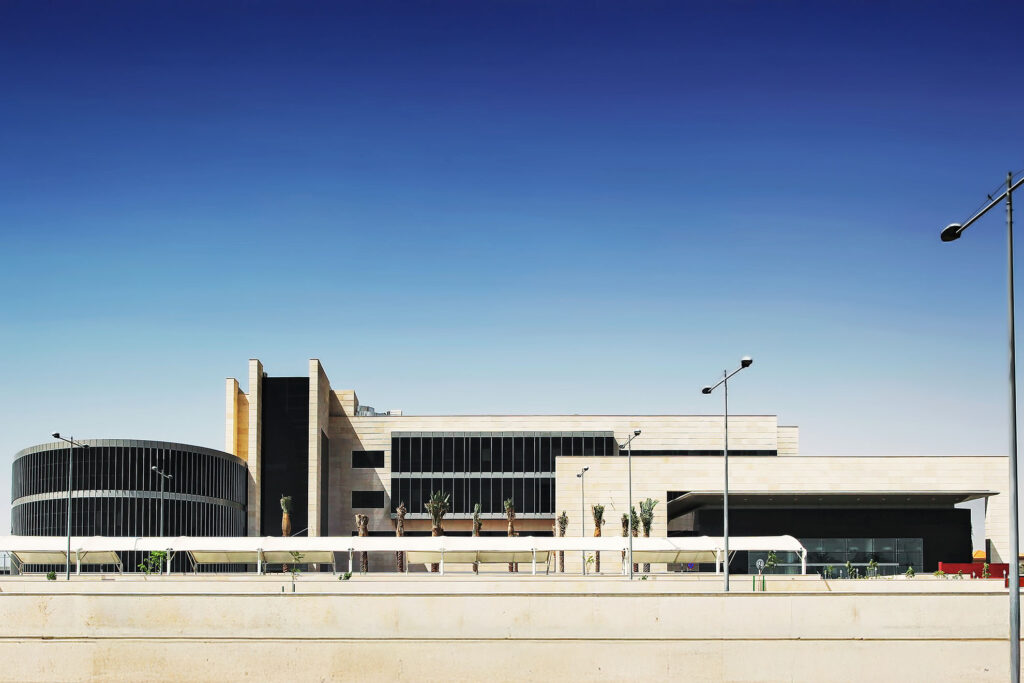
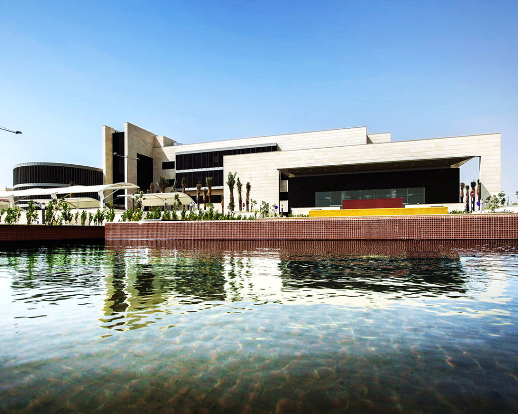
My example is Al Qassimi Hospital in Sharjah, in the UAE. The maternity and children’s hospital and the new emergency department were to be built next to the old hospital, dating from the 1980s: a vaguely postmodern building in faded pink, with little arches to remind you that you were in an Arab state. It was very compact, and destined to have its facade changed within a few years at the management’s wish, to give the hospital a more modern look. Which is exactly what happened. The reference for the facade restyling was the new cardiac surgery pavilion then under construction in the complex, right next to our site: a late modernist building, typical of the UAE, with a facade of horizontal white panels and dark grey glazing.
Here’s my idea: if you want to hang awnings on your balcony and the other flats in your building already have awnings, you follow those. You don’t do your own thing and shuffle the deck just because you feel “cooler” and want to prove it. So the real existing building, the one that was going to stay, was the pavilion under construction.
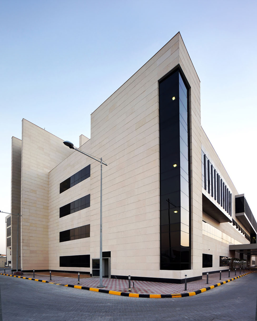
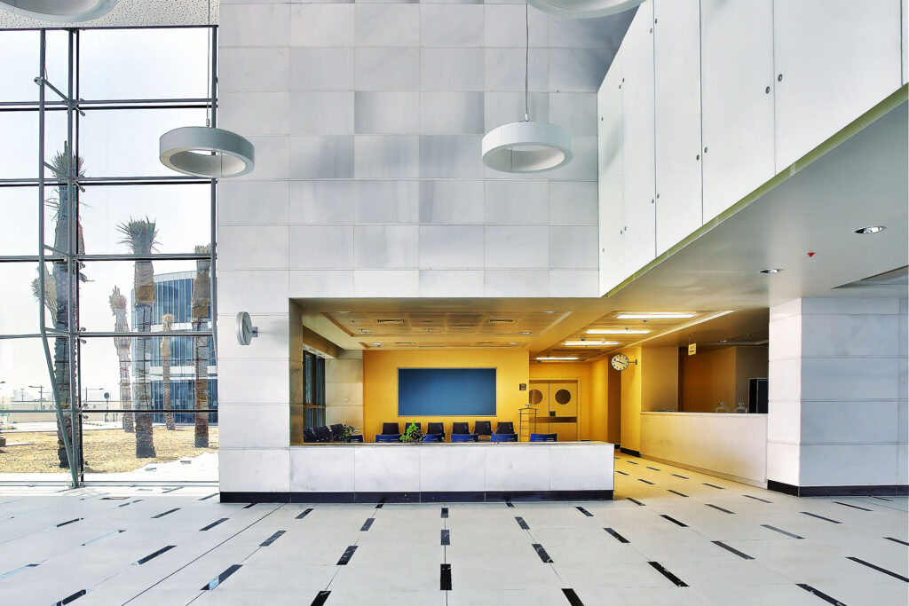
From there, and from my idea of a hospital as a machine for healing, the step was fairly obvious: an ideally white building that conveys cleanliness, but also efficiency and functionality. If I have to get tests done or be treated, I want to go to the best place, one that first of all gives me an impression of modernity, cleanliness, calm. If you want an efficient phone and you can afford it, you might look at an iPhone, which conveys modernity and efficiency, not a phone with an outdated design that looks like it’s made of dubious materials… Luckily there was the budget and the willingness to use stone on the facade. And I have to say that the architect Dagmar Sestak, with whom I designed the hospital, was more rational and rigorous than I was, and she helped give the project a cleaner, more disciplined look. I was lead designer and project manager, but I remember some heated discussions: in the end we always agreed on a solution that satisfied us both.
The black glass (unplanned)
Then there’s a detail that no textbook on existing context would have taught you. I chose the glass on site, outdoors, under the scorching, blinding Emirati summer sun. The alternatives offered by the contractor ranged from dinosaur green to electric blue, by way of other indescribable, unusable colours. I chose a dark grey, in line with the neighbouring pavilion.
Once installed, though, the smoke-grey panes, with no strong interior lighting and having to reflect the violent light of that latitude, simply turned black. In photographs they look like absolute black. It wasn’t exactly intended, but I believe the building gained a character of its own thanks to it. With a bit of luck, the result improved on what I had designed.
Here’s what I took from it: research on the context, site visits, listening to a place, none of it guarantees the result, but it gets you close enough that when chance comes along, it works in your favour.
The building was designed almost twenty years ago and is still current today. I hope it stays that way for a long time. A sober, neo-modernist style doesn’t age quickly, and for a public building that has to last, that’s what matters most.